CSS DOCUMENTS

CSS stands for Cascading Style Sheets. These documents are used to style specific HTML elements within the application. Even though these elements can be styled in-line within the HTML document itself, it is most often preferred to group all of these styles in a single document where they can easily be organized and modified.
01
fonts.css
This document is created to act as a source file for the fonts that are downloaded to be used in the application. When one of the fonts is required, it only needs to be referenced by it's name. The following code snippet is an example of a font that was added to the fonts.css file. In this example orbitron was used. Click on the following link for instructions on how to download and prepare the font. donwload/prepare
Copy and paste the following infto fonts.css
Replace the font shown here with the one of your chossing.
/*Orbitron*/
@font-face {
    font-family: 'orbitron';
    src: url('/static/fonts/orbitron-v31-latin-regular.woff2') format('woff2');}
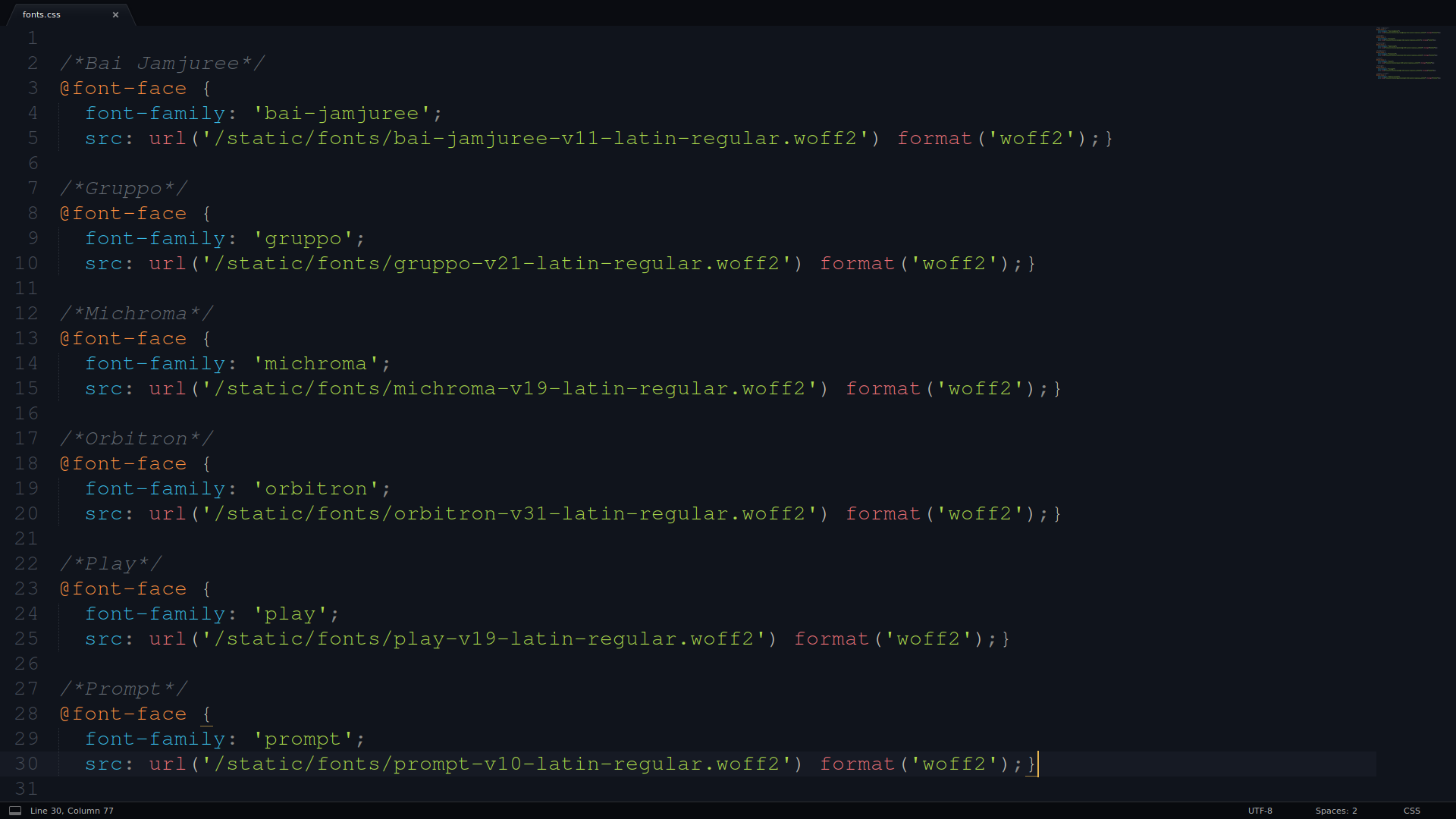
The screen-shot below is an example of this file with multiple font styles added. When one of them is required, only it's font-family name needs to be used.

After the font has been downloaded and added the the fonts.css file... before it can be used, the fonts.css file will need to be linked in the HTML document. Typically, this is done in layout.html within the <head></head> tags. This will allow it to be utilized in any of the HTML pages. The following command will link this file (fonts.css) to all of the applications HTML documents.
<head>
    <link rel="stylesheet" type="text/css" href="{{ url_for('static', filename='css/fonts.css') }}">
</head>
The example below shows how to use the orbitron font that was added to the fonts.css file. The code snippet below was added to styles.css, where it was used to style the h1 headers
header h1
    {box-sizing: border-box;
    width: auto;
    height: auto;
    font-size: 40px;
    font-size: 4.0rem;
    font-family: 'orbitron';
    margin: 0;
    margin-top: auto;
    margin-bottom: auto;
    padding: 1%;
    color: #E0E0E0;}
02
styles.css
This document is created to style the HTML elements contained within the application. It controls how these elements are positioned and how they appear to the user. The following code snippet is an example of how the h1 header can be styled and positioned on the page.
Copy and patse the following into styles.css
Adjust these properties to suit your application
html
  {width: 100%;
  height: 100%;
  padding: 0;
  margin: 0;
  font-size: 62.5%;
  box-sizing: border-box;}
body
  {background-color: #000000;
  background-size: cover;
  background-position: center center;
  background-attachment: fixed;
  width: 100%;
  height: 100vh;
  min-height: 100%;
  padding: 0;
  margin: 0;}
#container_main
  {box-sizing: border-box;
  font-size: 0;
  position: relative;
  width: 100%;
  min-height: 100vh;}
header
  {box-sizing: border-box;
  position: fixed;
  width: 100%;
  height: 80px;
  z-index: 20;
  top: 0;
  margin: 0;
  padding: 0;
  font-size: 0;
  background-color: #1D2125;
  border-width: 1px;
  border-top-width: 0px;
  border-left-width: 0px;
  border-right-width: 0px;
  border-color: orange;
  border-style: solid;}
.header-container
  {box-sizing: border-box;
  width: 100%;
  height: 100%;
  display: inline-block;
  margin: 0;
  padding: 0;
  font-size: 0;}
.header-container-left
  {box-sizing: border-box;
  width: 760px;
  height: 100%;
  display: inline-flex;
  float: left;
  margin: 0;
  padding: 0;
  padding-left: 2%;
  font-size: 0;}
.header-container-left img
  {box-sizing: border-box;
  width: 60px;
  height: 60px;
  opacity: 0.8;
  margin: 0;
  margin-top: 10px;
  padding: 0;
  font-size: 0;}
header h1
  {box-sizing: border-box;
  width: auto;
  height: auto;
  font-size: 40px;
  font-size: 4.0rem;
  margin: 0;
  margin-top: auto;
  margin-bottom: auto;
  padding: 0;
  padding-left: 1%;
  color: #E0E0E0;}
.header-container-right
  {box-sizing: border-box;
  background-color: #1D2125;
  justify-content: right;
  width: 715px;
  height: 100%;
  display: inline-flex;
  float: right;
  margin: 0;
  padding-top: 25px;
  padding-right: 2%;
  font-size: 0;}
.header-container-right a
  {box-sizing: border-box;
  display: block;
  width: auto;
  height: 30px;
  text-decoration: none;
  margin: 0;
  padding: 0;
  margin-right: 2%;
  padding: 2%;
  padding-top: 5px;
  font-size: 16px;
  font-size: 1.6rem;
  color: #B1A9A9;
  transition-duration: .2s;}
.header-container-right a:hover
  {opacity: 1.0;
  color: #FFFFFF;
  background-color: rgb(61, 89, 116, 0.9);
  border-color: #E0E0E0;}
.container
  {box-sizing: border-box;
  width: 100%;
  height: auto;
  background-color: #CCD2DF;
  padding-top: 0px;
  padding-bottom: 80px;
  margin: 0;
  overflow: hidden;}
.container h4
  {box-sizing: border-box;
  width: 100;
  margin: 0;
  padding: 5%;
  text-align:  center;
  font-size: 30px;
  color: grey}
footer
  {box-sizing: border-box;
  position: absolute;
  background-color: #1D2125;
  text-align: center;
  clear: both;
  height: 80px;
  width: 100%;
  bottom: 0;
  margin: 0;
  padding: 0;
  padding-top: 33px;
  border-width: 1px;
  border-bottom-width: 0px;
  border-left-width: 0px;
  border-right-width: 0px;
  border-color: orange;
  border-style: solid;
  color: #E0E0E0;}
footer h4
  {box-sizing: border-box;
  font-family: 'gruppo';
  display: inline-block;
  width: 90%;
  margin-left: 5%;
  margin: 0;
  padding: 0;
  font-size: 14px;
  font-size: 1.4rem;
  color: #E0E0E0;}
.feature
  {box-sizing: border-box;
  background-color: #383847;
  width: 100%;
  height: 102vh;
  position: relative;
  display: flex;
  flex-direction: column;
  border-style: solid;
  border-color: grey;
  border-width: 1px;
  border-top-width: 0px;
  border-left-width: 0px;
  border-right-width: 0px;
  margin: 0;
  padding: 0;
  padding-top: 80px;
  font-size: 0;}
.feature-center
  {box-sizing: border-box;
  width: 100%;
  position: relative;
  top: 50%;
  transform: translateY(-50%);
  padding: 2%;}
.feature-center h4
  {box-sizing: border-box;
  width: 100%;
  text-align: center;
  margin: 0;
  margin-top: 1%;
  padding: 0;
  color: #D2ACAC;
  font-family: marck-script;
  font-size: 40px;
  font-size: 4.0rem;}
Before the styles.css file can be used, it will need to be linked in the HTML document. Typically, this is done in layout.html within the <head></head> tags. This will allow it to be utilized in any of the HTML pages. The following snippet will link the (styles.css) file to all of the applications HTML documents.
Link the styles above
Located in the layout.html document ceated earlier.
<head>
    <link rel="stylesheet" type="text/css" href="{{ url_for('static', filename='css/styles.css') }}">
</head>
03
quries.css (media quries)
This document is created to modify how the elements within the HTML documents are presented to the user when the screen size has been changed. For example... when the size and shape of the screen has been modified to accommodate for desktop computers, tablets and smart phones.
Link the styles above
Shown below is an example of how the CSS properties of particular HTML element can be modified to accommodate for the width or height of the screen. The sizes and the placements of the containers can be altered here when required by the user and the type of device that currently being used.
/* MAX WIDTHS */
@media(max-width: 900px){
    header h1
    {font-size: 23px;
    font-size: 2.3rem;}
    .container
    {display: block;}
    .container-left
    {float: none;
    width: 100%;
    .container-right
    {float: none;
    width: 100%;}}

/* MAX HEIGHTS */
@media(max-height: 720px){
    .main-menu
    {height: auto;
     padding-bottom: 5%;}}
Before the quries.css file can be used, it will need to be linked in the HTML document. Typically, this is done in layout.html within the <head></head> tags. This will allow it to be utilized in any of the HTML pages. The following snippet will link the (quries.css) file to all of the applications HTML documents.
Link this file to layout.html
<head>
    <link rel="stylesheet" type="text/css" href="{{ url_for('static', filename='css/quries.css') }}">
</head>
04
animations.css
This file is used to provide animations to various HTML elements. These animations can be used to change the appearance and placement of various containers on the screen. These animations can occur when the page loads, or after a user action. The following code snippet is an example of some of the animations. To use the animation, add it's class to the HTML element.
Create the animations.css file
/* FADING CONTAINER  */
.fade-slow
    {opacity: 1.0;
    animation-name: fade-slow;
    animation-duration: 3s;
    animation-iteration-count: infinite;}
@keyframes fade-slow {
    0% {opacity: 0.8;}
    50% {opacity: 0.32;}
    100% {opacity: 0.8;}}

/* SLIDING CONTAINER  */
.slide-up
    {position: relative;
    animation-name: buttonslide;
    animation-duration: 3s;
    animation-fill-mode: forwards;
    animation-timing-function: ease-in-out;}
@keyframes buttonslide {
    0% {top: 10vw; opacity: 0;}
    100% {;top: 0; opacity: 1.0;}}

/* COIN SPINNER */
.coin-spinner
    {animation-name: coinspinner;
    animation-duration: 3s;
    animation-delay: 2s;
    animation-iteration-count: 1;}
@keyframes coinspinner {
    0% {transform: rotateY(0deg);}
    100% {transform: rotateY(360deg);}}
Link the animations.css file
Before the animations.css file can be used, it will need to be linked in the HTML document. Typically, this is done in layout.html within the <head></head> tags. This will allow it to be utilized in any of the HTML pages. The following snippet will link the (animations.css) file to all of the applications HTML documents.
<head>
    <link rel="stylesheet" type="text/css" href="{{ url_for('static', filename='css/animations.css') }}">
</head>
05
HTML Links
In order to utilize the .css files, a link to them in the HTML documents will be required. The following code snippet links all the above mentioned .css files to all HTML documents within the application, located within the head tags of layout.html
Link all required animations.css files in layout.html
If any of these styles are only requried or need by a specfic HTML page, it only needs to be liked from that page. If you are just starting and not sure where to link which files to what, just put them all in layout.html for now.
<head>
    <link rel="stylesheet" type="text/css" href="{{ url_for('static', filename='css/fonts.css') }}">
    <link rel="stylesheet" type="text/css" href="{{ url_for('static', filename='css/styles.css') }}">
    <link rel="stylesheet" type="text/css" href="{{ url_for('static', filename='css/quries.css') }}">
    <link rel="stylesheet" type="text/css" href="{{ url_for('static', filename='css/animations.css') }}">
</head>

